Intergrating an Acquisition with Growth Design and Design Systems
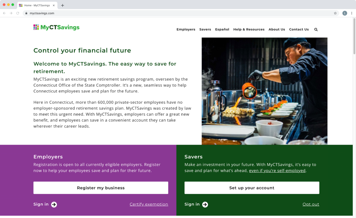
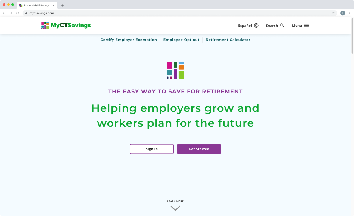
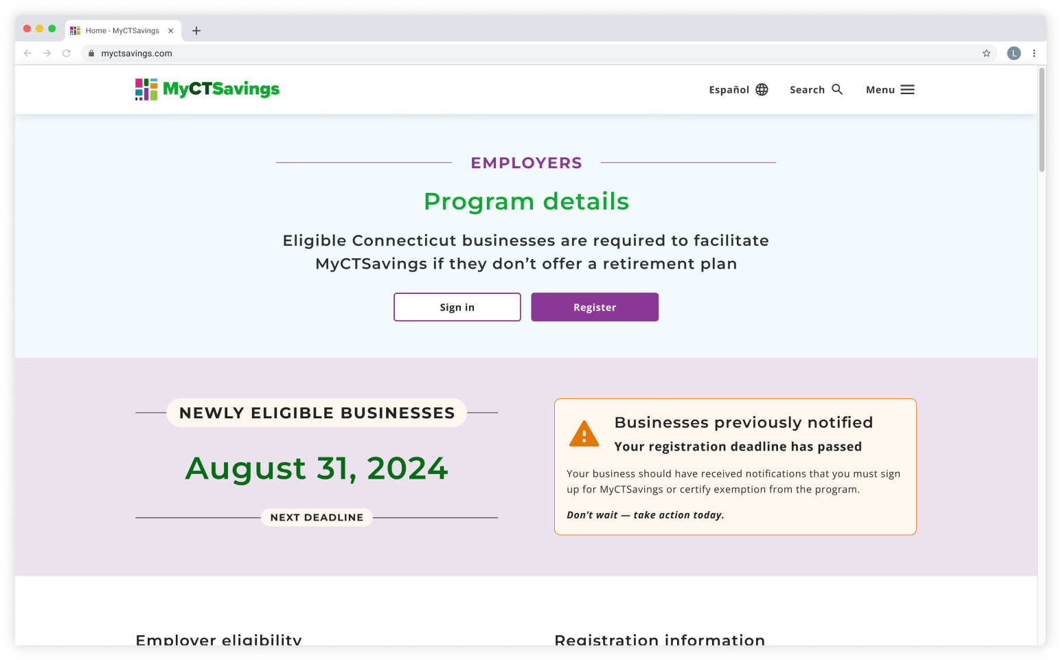
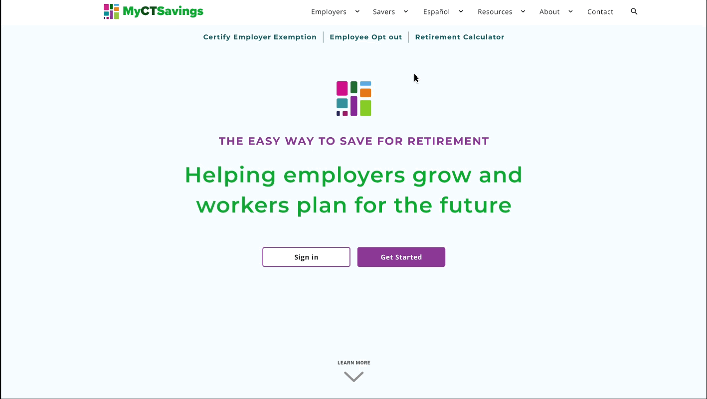
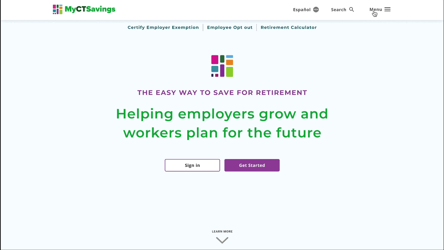
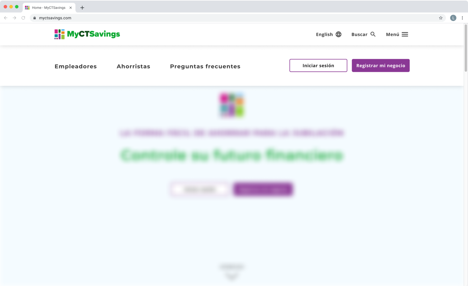
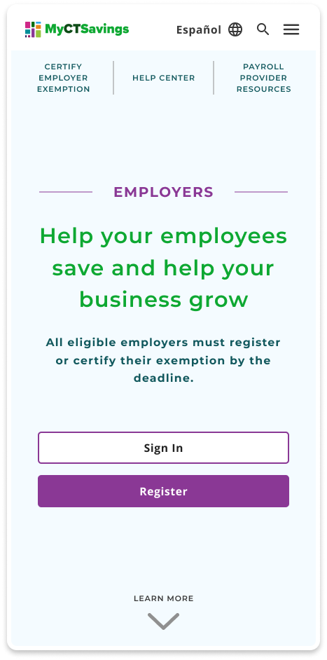
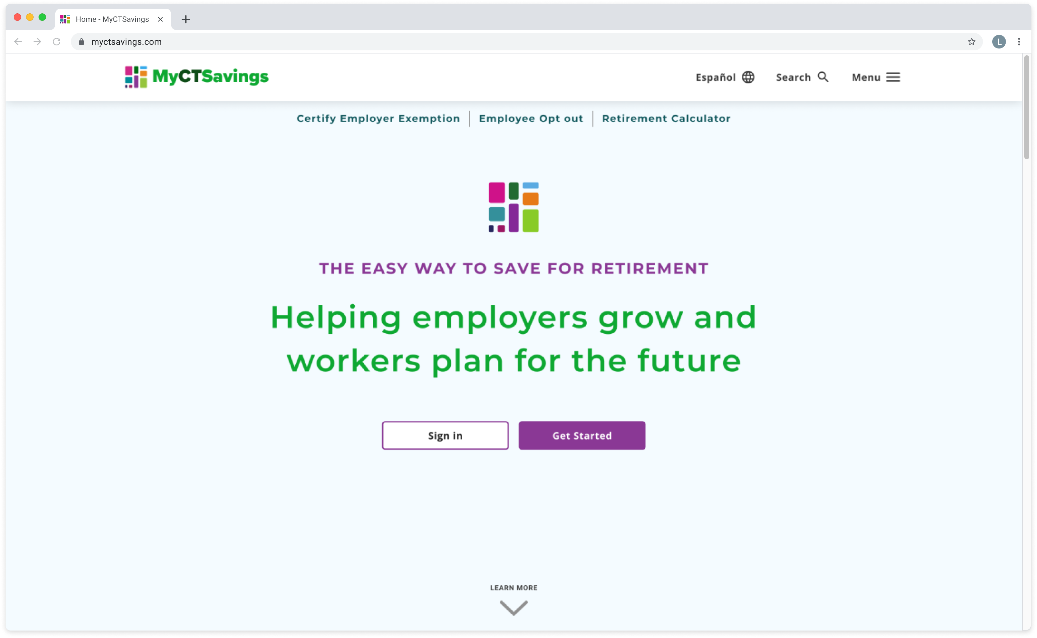
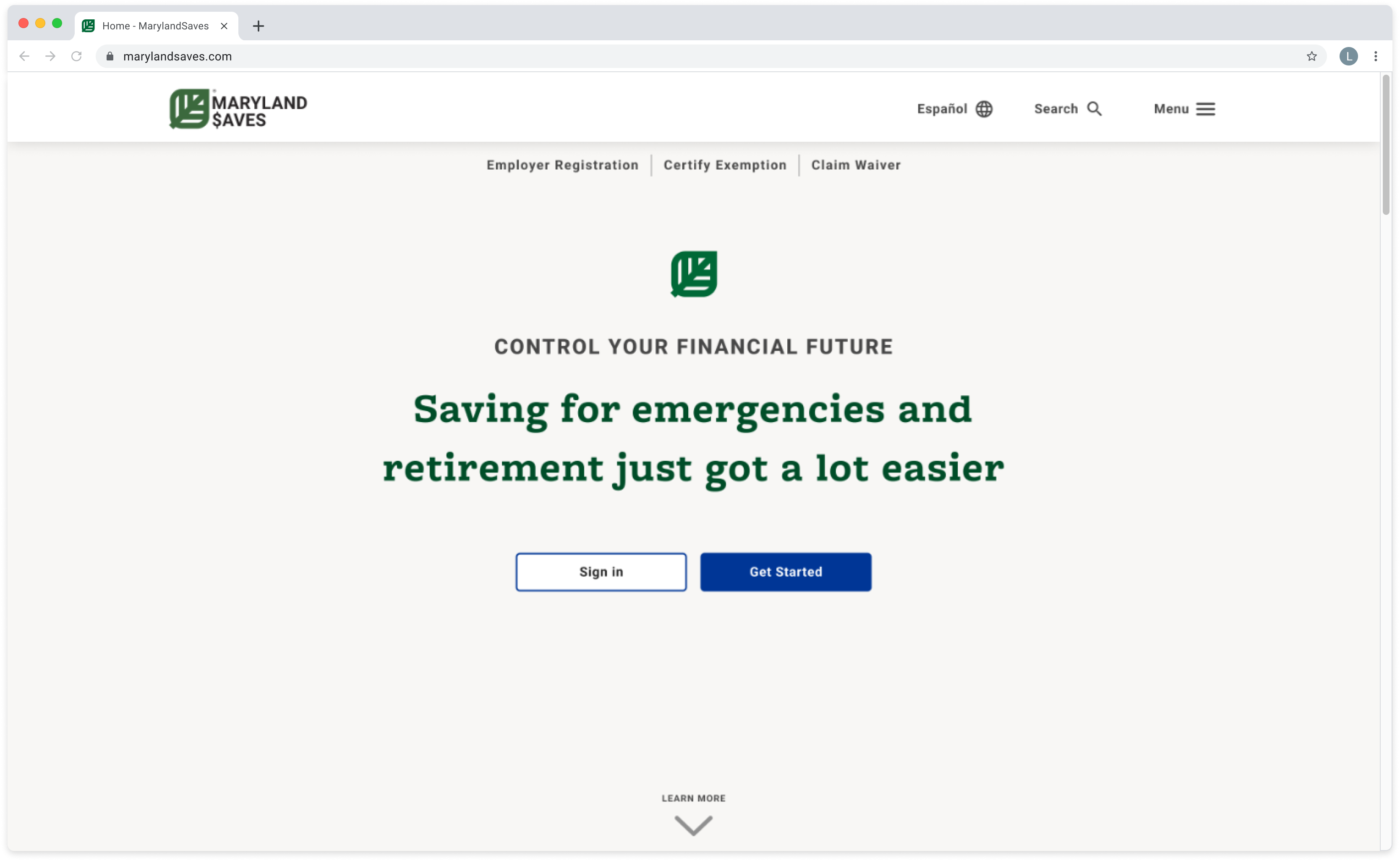
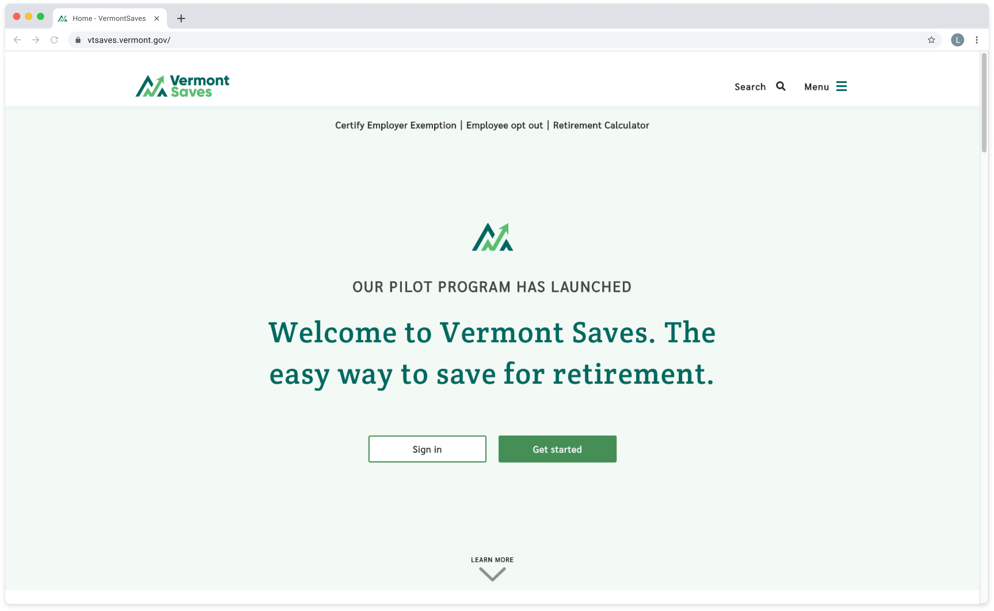
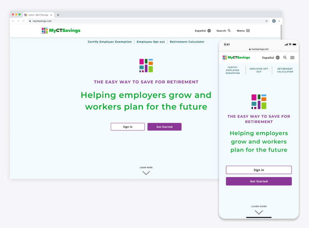
Helping Connecticut Save for the Future
Redesign state retirement savings program’s website to increase financial literacy for the residents of Connecticut for savers and employers.
The Challenge
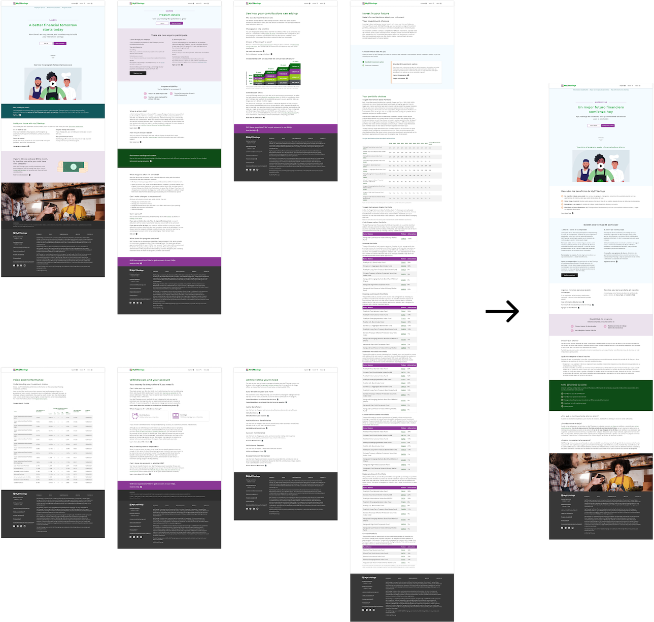
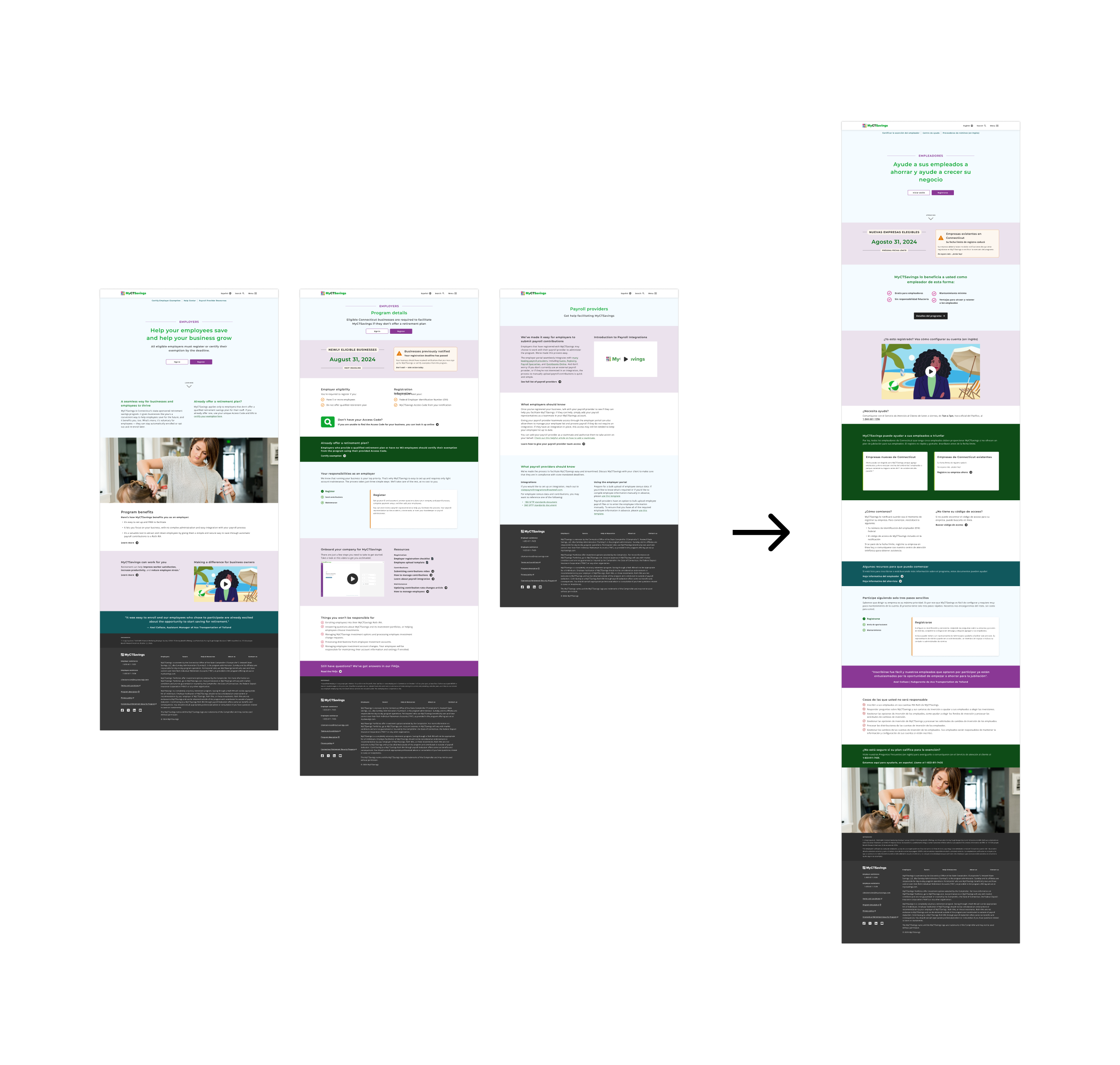
As part of Vestwell's effort to unify the newly acquired state savings program clients and support Unified Log In, a single platform for employers and savers, our team was tasked with redesigning the Connecticut Office of the State Comptroller’s savings program.
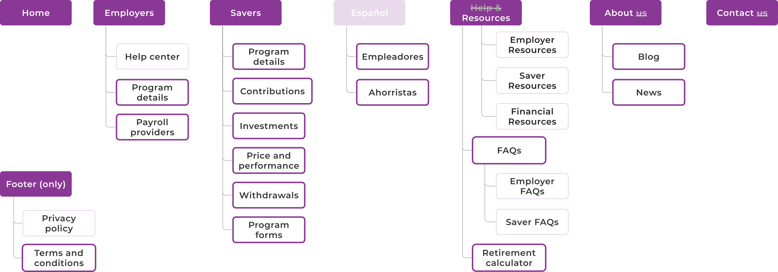
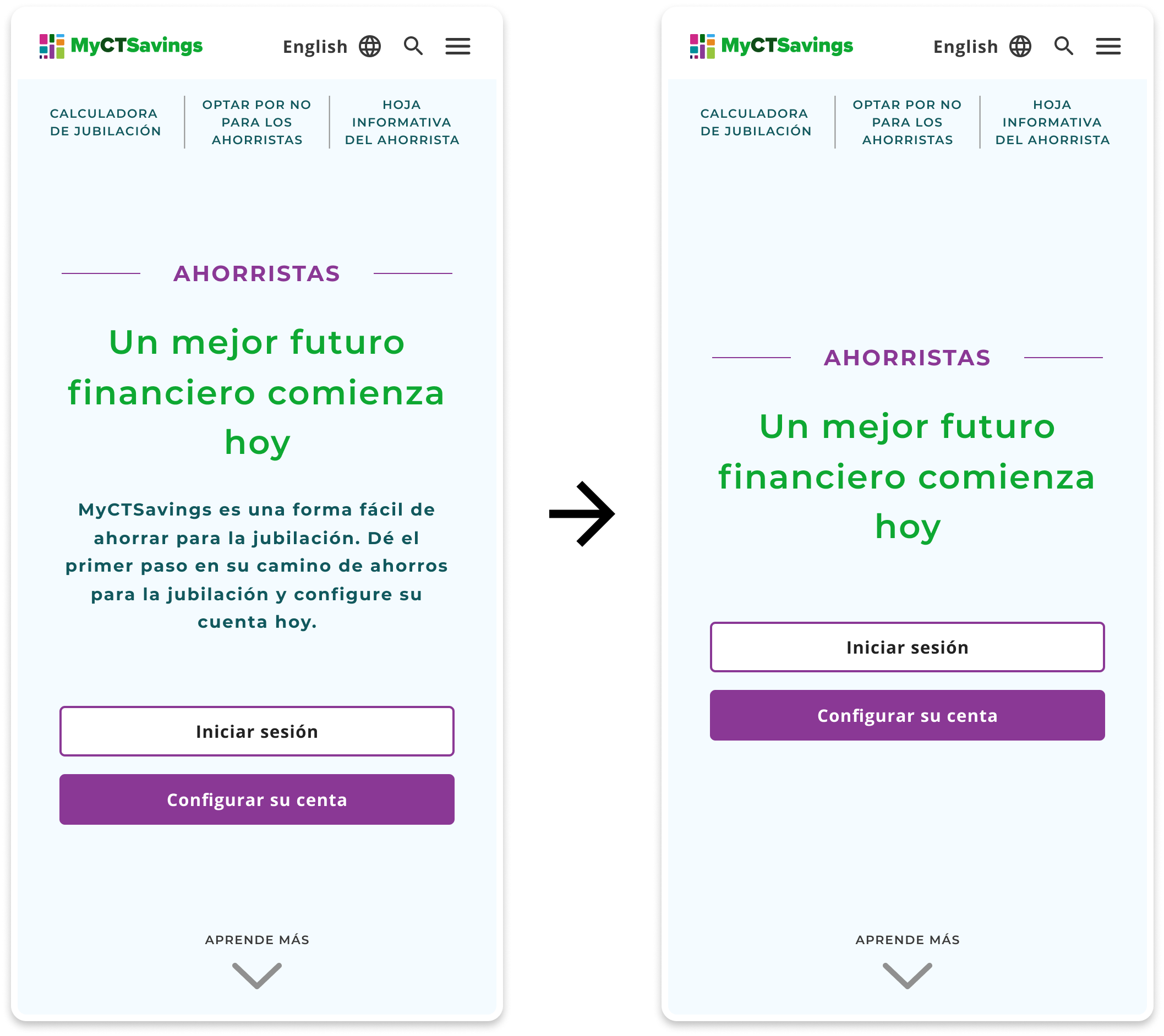
The redesign aimed to modernize the look while keeping the existing site map.
Role
Product Designer
Responsibilities
Product Design, User testing, Design Systems
Team
Design Manager,
2 Product Designers,
Tech Lead,
1 Engineer,
1 Copywriter
Tools
Figma, Lyssna, CSS
Links
Final Solution

Defining Success
The Marketing Communication sites help direct users to Unified Log-in, our success criteria is the client’s satisfaction which varies from client to client.
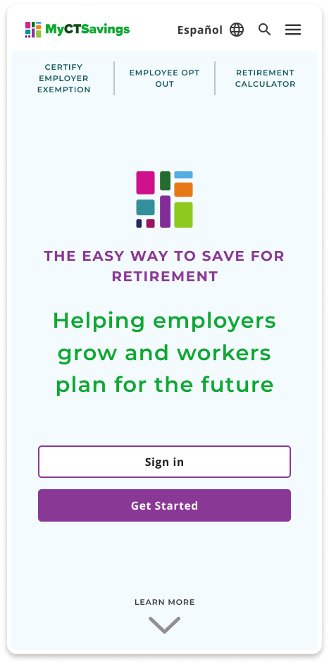
For My CTSavings, our client wanted the website to be a point of showcasing existing branding and messaging of the program.
Key Guidelines
Brand Colors, Timeline, Client Feedback, State Regulations, Legal Compliance, ADA Compliance
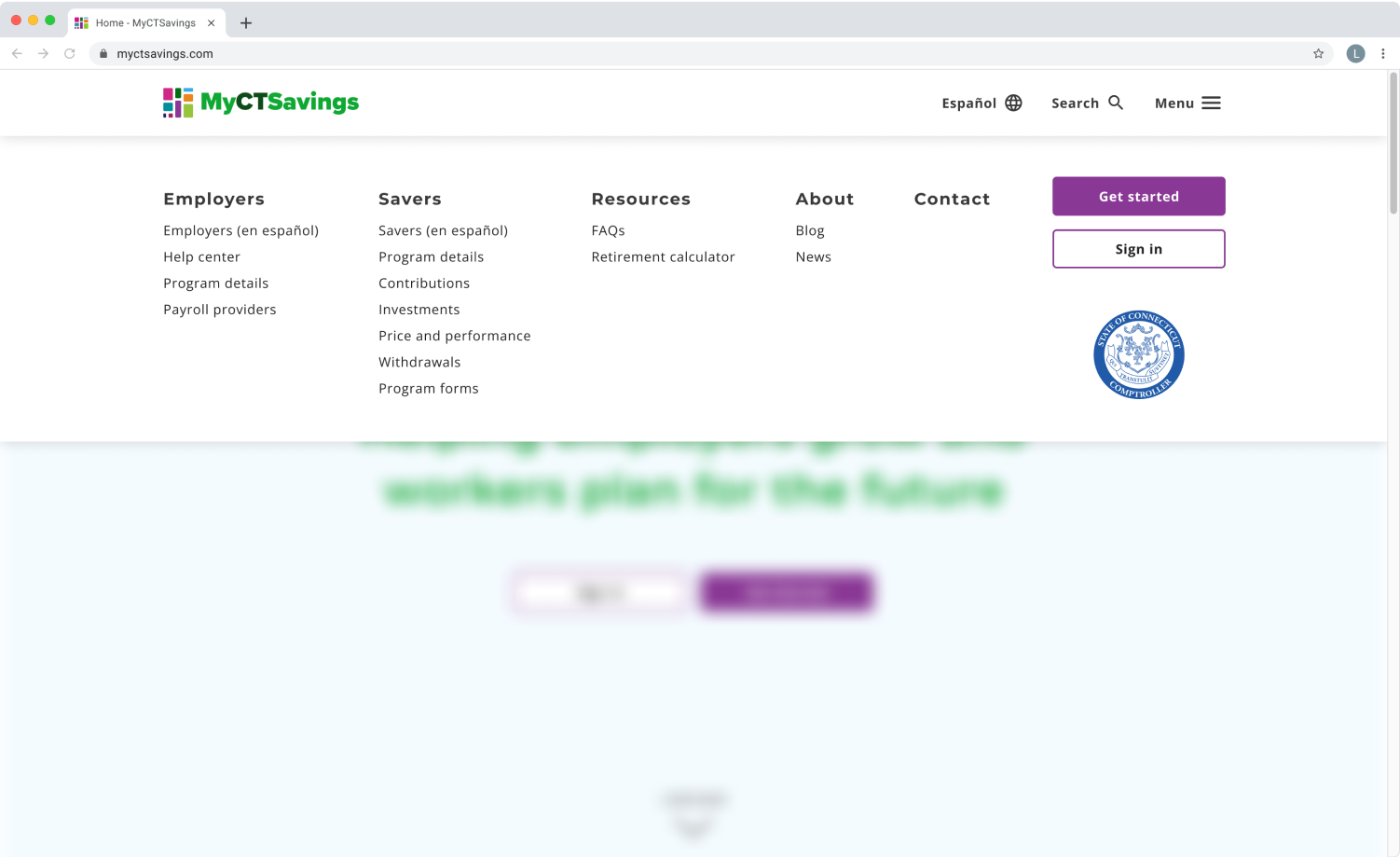
Targeted Users
We targeted users who are included in the process of setting up and contributing to an autoira savings account. Our primary users were savers and employers with payroll providers and other family as secondary.