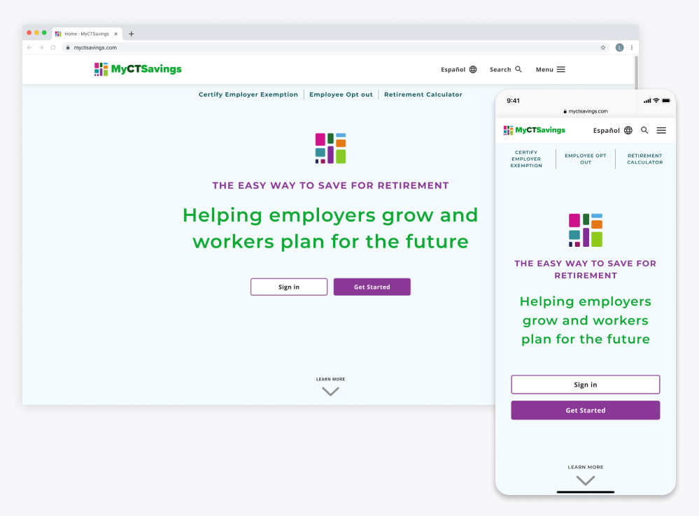
Known Source

Shop with confidence from dealers you know.

A UK-based startup working on creating e-commerce marketplace for second-hand luxury goods to tackle the problem to excess fashion.

image of three mobile displays of the redesign, text reads: only the best for christmas, archive 89, and vintage stone island shimmer jacket (xl)

Goal

Create a responsive and accessible that appeals to the Known Source target audience, that helps to portray their USP of being human centric brand.

Problem

Before their launch, we were tasked to redesign their website storefront and explain their USP ecosystem of circular circulation.

Solution

Changed the design to be clean and easy to navigate. Added copy sections to describe the company and bring credibility.

Role

UX Designer

Date

Sept 2022 - Dec 2022

Tools

Figma

Project

Website Redesign

Final Solution

diagram of circular curation, shoppers buying better directly from dealers, to get quality second hand goods, later to renew and sell back to other shoppers

Redesign Comparison

About Page

Before

After

Dealer Page

Before

After

Limitations

Branding Colors, Time, Stakeholders, Capacity of Teams, Business Needs, Business Budget

Team

Worked directly with stakeholders, 1 design supervisor, 3 designers.
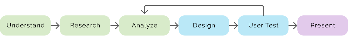
Design Process

diagram of steps of design process, understand, research, analyze, design, user test, then present

Problem Definition

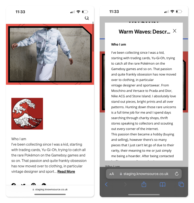
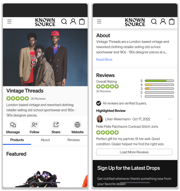
The clients identified the Home, About, Dealer, and Product pages as areas for improvement.

Target User Groups

  • Buyers - Customers of known source
  • Seller - Dealers partnering with Known Source to sell their goods.

What is Circular Curation?

The idea that buyers can resell goods back to the platform, promoting sustainability through reuse.

Two Step Process

  • Buy Better - consciously purchasing decisions
  • Renew - resaling of goods back to the marketplace for sustainability
diagram of circular curation, shoppers buying better directly from dealers, to get quality second hand goods, later to renew and sell back to other shoppers

Understanding the Problem

We conducted usability testing and user surveys to discover painpoints.

Usability Testing

Testing was conducted to evaluate the effectiveness and efficiency of the marketplace's current interface. Participants were given tasks to perform on the platform while their interactions were observed and recorded. They consists of both experienced and inexperienced second hand shoppers.

Usability Results

  • Product Details
  • Lack of product details

  • User were unfamiliar with interactions
  • UI and copy issues

  • Trust and credibility
  • What’s the process of verification of these dealers?
    Who are they are why should we buy from them?
sticky notes with text representing the notes from user interviews

Survey Results

Users were surveyed to understand their motivations for shopping second-hand and to identify any challenges they encounter in the process.

Reasons to Shop Second-Hand

63.4%

Cost-Efficient

46.3%

Exclusive Designs

46.3%

Sustainability

Painpoints Shopping Second-Hand

48.8%

Product Quality Concerns

39.0%

Limited Size Options

36.6%

High Price Perception

Key Insights

From our research we concluded users needed this major points.

1

Create community

Copy text and features that create community on and off the platform.

2

Trust amongst users

Establish trust between buyers, dealers, and Known Source, through clarity of status of goods and processing.

3

Sustainability

Copy text supports message of sustainability through buying second hand.

Design

Curation through community

Explore known source through your favorite dealers

Feature Prioritization and Ideation

After creating a list of improvements and additional features that would benefit the user, we ranked them and then took the top 12 and using the now next later method to prioritize work.

Ideation Methods

  • Mindmapping
  • SCAMPER

Afterward, our team created sketches to create different variations how might we design the information.

screenshot of knownsource about page section for dealers.

Mobile Userflow

Starting from the home page

userflow diagram of each step, scrolling to dealers, selecting archive 89, scrolling down to popular picks, browsing popular items, selecting stone island jacket, and then opening the product page

Style Guide

screenshot of knownsource about page section for dealers. Button Components
screenshot of knownsource about page section for dealers. Colors

Usability Testing

User Test Results

We discovered users wanted more information about the dealers who they were unfamilar with and sustainability efforts.

The feedback we got from usability testing is reflected in the final design.

screenshot of knownsource about page section for dealers.

Final Design

About Page

Read more about what makes Known Source different.

Breakdown of Circular Curation

Founders’ Bios

Partners’ Testimonies and Sustainability Efforts

Dealer Page

Find dealers you love and discover others you might also like.

  • browse dealers’ pages and see what they have curated.

Browse Dealer Info
Jump to a Section

Browse Featured
Products

Browse About and
Reviews Sections

Outcomes

Successfully completed client presentation and design proposal.

  • Delivered prototypes from pre- and post- user testing.
  • Presentation was received well, and planned integration of the about page and later additions for other pages.

Postmortem

Our team presented the redesign in a presentation style to show case our research, process, and insights. The clients liked the presentation, after the review.

The clients decided to integrate the about page first as it strengthen their credibility and humanize the company.

Reflection

Since our client was based in the UK, it was hard to get feedback and initial insight to how their dealers and selling process looked like. Since we were in charge of the user facing side, I was not aware how the envisioned integrating the dealers page as well as I would have liked.

Recommended Works